Whose 15-Minute City? Measuring Equity of Access in Chicago
In August 2020, MPC Transportation Associate Jeremy Glover published a blog post entitled “The 15-Minute City: How close is Chicago?” He used spatial data to evaluate Chicago through an urbanist lens that was (and arguably still is) having a moment. The 15-Minute City is a chrono-urbanist paradigm, one which centers time as a key metric for city planning, suggesting that the ideal city is one in which residents can live a full and healthy life within 15 minutes from home. Jeremy focused on a core component of the policy: the proximity to resources necessary for daily urban life. He used GIS (geographic information system) software, built for analyzing and manipulating spatial data, to produce maps showing which parts of Chicago can access key destinations within fifteen-minute walks and bike rides. He found that while most areas of the city have good access via foot or bike, when limited to walking, the areas of best access are limited to smaller clusters, more heavily concentrated on the North and West sides.
Jeremy acknowledged limitations to the analysis, including, most importantly, the fact that proximity is only one component of accessibility. You may have a destination nearby, but there may be tremendous variation in the route there and the destination itself. Further, Jeremy’s measure of proximity did not take into account the quantity of choices. Namely, for many destinations, it’s better to have more options, all else equal.
I discovered the downside of framing a holistic accessibility policy through the narrow concern of proximity.
Given Chicago’s stark patterns of segregation—both socioeconomic and racial—I wanted to better understand how the spatial patterns Jeremy found related to people. In my master’s project, “Whose 15-Minute Windy City?: Evaluating Access to Walkable Places in Chicago,” I investigated this question, using Jeremy’s walkability analysis as a jumping-off point. I aimed to understand how demographics differed among areas with different levels of access, but also took a closer look at a selection of high-access clusters across the city. Through this investigation, I discovered the limits of Jeremy’s analysis, and thus the downside of framing a holistic accessibility policy through the narrow concern of proximity.
Demographics: Who lives in 15-minute pedestrian neighborhoods?
While Jeremy’s analysis related destinations to the walking and biking network in Chicago, the brunt of my GIS methodology was focused on assigning American Community Survey (ACS) data, associated with Census block groups or tracts, to a different spatial pattern: the access zones that Jeremy determined. Briefly, I determined the proportion of each block group’s residentially-zoned area that fell into each level of access (0-8 resources), then applied this proportion to ACS demographics, and summed these chunks. The result is a demographic profile for residents living in each access level.
Jeremy’s analysis looked at access to eight different resource categories: grocery stores, parks, libraries, primary schools, secondary schools, hospitals or urgent cares, pharmacies, and CTA ‘L’ stations. Each point in the city was assigned an access zone based on how many resource categories one could reach within a 15-minute walk or bike ride, with a minimum score of zero and a maximum of eight. I took these zones and combined them with data from the American Community Survey (ACS) to create a demographic profile for residents living at each access level.
While only 5% live within a 15-minute walk of all eight categories of resource, more than half of Chicagoans have 15-minute walking access to at least six. The corresponding land area of Chicago is significantly less than 50%, which corresponds with data that suggests that increasing levels of access also see increases in population density.
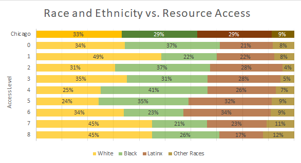
When examining the levels of access by other demographic basics like race and ethnicity, the pattern becomes less clear. One takeaway is that White Chicagoans are over-represented at the highest levels of access. While Whites also appear to have disproportionate levels of access to only one resource category it is important to remember that low levels of access aligned with the border of the city with its suburbs, where access may be artificially skewed.
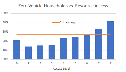
We see some patterns that suggest that low-wage workers may rely more on high-access neighborhoods than others. In general, the presence of more resource categories tends to correlate with decreasing car ownership; in areas with greatest access, more than 40% of households are without a vehicle. The highest poverty rate (22%, compared to an 18% city average) is also found at the highest level of access. On the other hand, areas with greatest access have the lowest unemployment rate (5%, compared to an average of 8% in the city) and the lowest levels of limited education (only 45% with less than a college degree, compared to 61% in Chicago on average).
How do 15-minute neighborhoods compare?
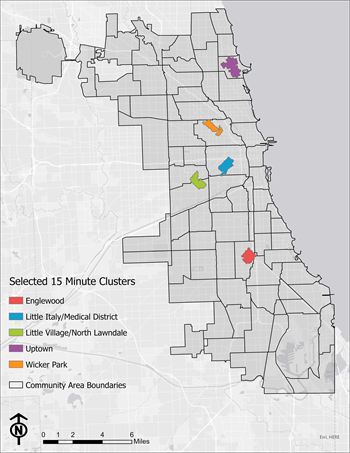
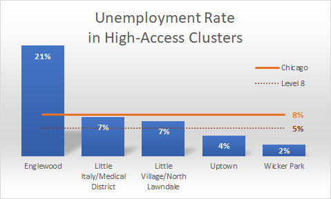
Of all the areas in the city in which residents had access to all eight categories of resource, some were more contiguous than others. Among the largest “patches” arose five 15-minute clusters. Here, they are identified by the neighborhood(s) they are located in: (from north to south) Uptown, Wicker Park, Little Italy/Medical District, Little Village/North Lawndale, and Englewood.
These neighborhoods often had less in common than their shared level of access would suggest.
These five clusters have diverse demographic profiles. They vary widely in population density as well as in race and ethnicity. The densest neighborhood, Uptown, is roughly half White, while the least dense neighborhood, Englewood, is roughly one-sixth as dense and 97% Black. The neighborhood with the greatest proportion of White residents is Wicker Park (68%); the most Latinx is Little Village/North Lawndale (67%). No high-access neighborhood has a racial/ethnic mix representative of the city at large, which is roughly evenly White, Black, and Latinx.
Unemployment rate, which appeared negatively correlated with access when examining the city as a whole, was significantly higher in Englewood (21%), while the other four neighborhoods sat below the city’s average of 8%. Wicker Park’s rate was a remarkable 2%.
Englewood also saw the highest poverty rate (43%), a metric seemingly correlated with increasing levels of access in the city. Interestingly, only Wicker Park (10%) had a rate lower than city’s average. While Englewood may have had a tendency to be more of an outlier, comparisons regularly revealed that these neighborhoods often had less in common than their shared level of access would suggest.
What does it mean?
There are many ways to define or measure accessibility. While coarse relative to more complicated methods, Jeremy’s approach did capture some truths about spatial structure that enables accessibility, evidenced by trends (population density, car ownership, education, etc.) across access levels. That said, large differences between clusters with the greatest level of access confirm that this measure is far from a complete picture of accessibility. A baseline proximity to resources—while a requisite of urban accessibility, 15-Minute City model or otherwise—will not in and of itself generate equitable outcomes. It follows that there may be no level of density of destinations that should be considered sufficient for achieving equity in accessibility.
A baseline proximity to resources will not in and of itself generate equitable outcomes.
While the name of the 15-Minute City suggests proximity is the focus, applications of the policy can be more holistic. Its most famous iteration—in Paris—includes messaging about spaces that consider pop-ups and underutilized spaces like schools as ways to inject resources into communities that need them. Alternative conceptions like the “1-minute city” emphasizes not proximity, but hyper-local, citizen-driven street design, which could be a useful approach for Chicago and other cities. Any strategies for planning imported (especially in a top-down manner) from other cities, countries, or continents should be regarded with healthy skepticism, as one-size-fits-all approaches are bound to ignore important nuances and autonomy of a place.

Doug Bright is a native Chicagoan and recent graduate of the Master of City and Regional Planning and Graduate Certificate in Innovation for the Public Good at the University of North Carolina, Chapel Hill. He is currently working as a Transportation Specialist on equitable approaches to Vision Zero with the City of Durham, North Carolina.